Module 45 Geographic computing & GIS
Let’s start by getting some data. Run the below code:
# This code is just for getting sewanee data into the repo in an easily readable format...
library(dplyr)
library(rgdal)
library(raster)
library(sp)
destination_directory <- '/tmp'
destination_file <- file.path(destination_directory, 'sewanee.zip')
download.file('https://raw.githubusercontent.com/databrew/intro-to-data-science/main/data/sewanee.zip',
              destfile = destination_file)
unzip(destination_file, exdir = destination_directory)
boundary <- readOGR(destination_directory, 'Boundary2016')
OGR data source with driver: ESRI Shapefile
Source: "/private/tmp", layer: "Boundary2016"
with 7 features
It has 2 fields
structures <- readOGR(destination_directory, 'Domain_Structures')
OGR data source with driver: ESRI Shapefile
Source: "/private/tmp", layer: "Domain_Structures"
with 1055 features
It has 113 fields
Integer64 fields read as strings:  Total_ft2 ft2_ea_flr
roads <- readOGR(destination_directory, 'Roads')
OGR data source with driver: ESRI Shapefile
Source: "/private/tmp", layer: "Roads"
with 404 features
It has 18 fields
Integer64 fields read as strings:  ID ID2 Column
elevation <- raster(file.path(destination_directory,
                              'DEM USGS 10m.tif'))
In-class exercises
Raster
What is the difference between raster data and vector data?
What kinds of vector data are there?
Let’s talk about projections: https://en.wikipedia.org/wiki/List_of_map_projections
Let’s fetch some raster data.
What kind of data is this? What is the structure?
Let’s break it down into just the continental United States.

- Plot it!
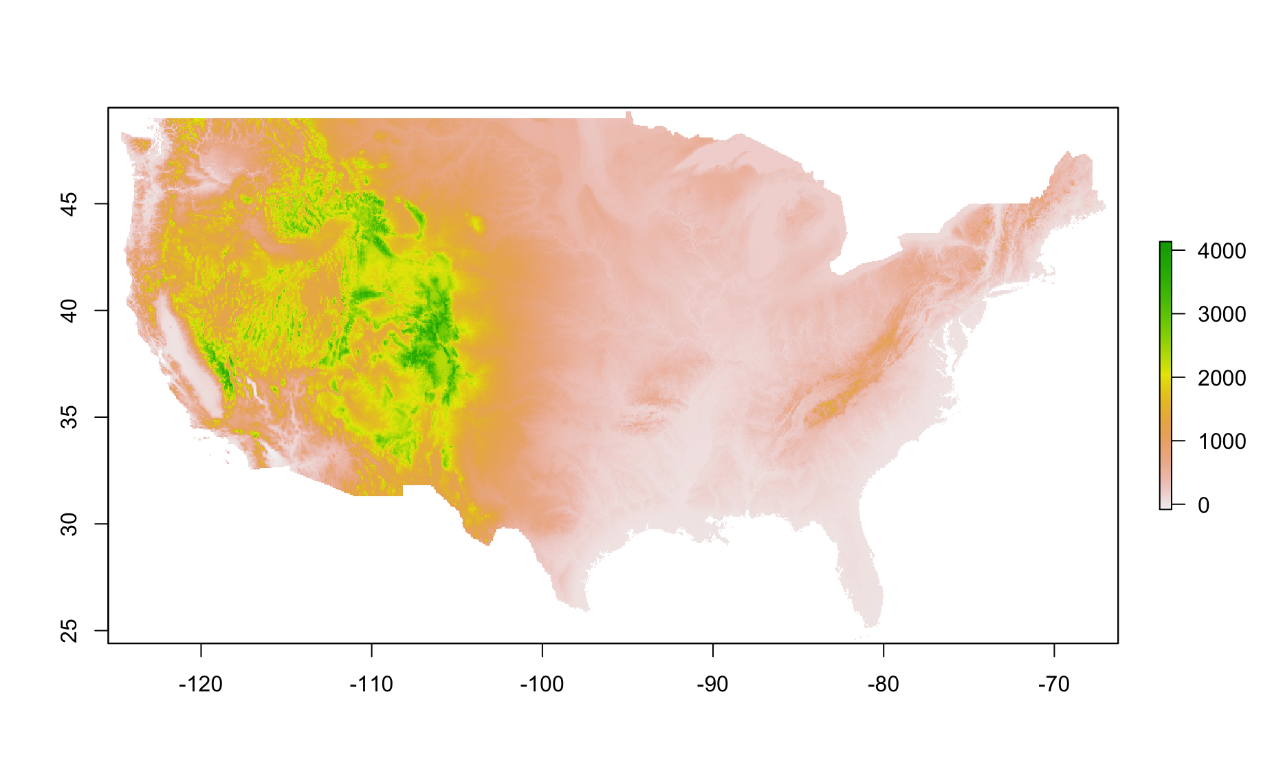
What do the values mean (the legend)?
Make a plot of Alaska.
Let’s retrieve some data for boundaries of States.
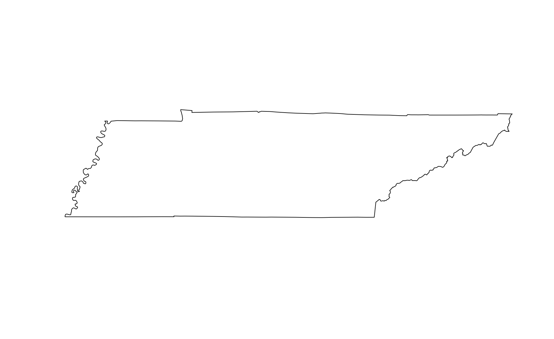
- Plot the states.
- Take a peak at the states data.
head(states)
   GID_0        NAME_0   GID_1     NAME_1 VARNAME_1 NL_NAME_1 TYPE_1 ENGTYPE_1
1    USA United States USA.1_1    Alabama   AL|Ala.      <NA>  State     State
12   USA United States USA.2_1     Alaska AK|Alaska      <NA>  State     State
23   USA United States USA.3_1    Arizona  AZ|Ariz.      <NA>  State     State
34   USA United States USA.4_1   Arkansas   AR|Ark.      <NA>  State     State
45   USA United States USA.5_1 California CA|Calif.      <NA>  State     State
48   USA United States USA.6_1   Colorado  CO|Colo.      <NA>  State     State
   CC_1 HASC_1
1  <NA>  US.AL
12 <NA>  US.AK
23 <NA>  US.AZ
34 <NA>  US.AR
45 <NA>  US.CA
48 <NA> US.CO- Make an object just for Tennessee.
- Plot Tennessee.

- Use the
cropandmaskfunctions to get just Tennessee elevation.
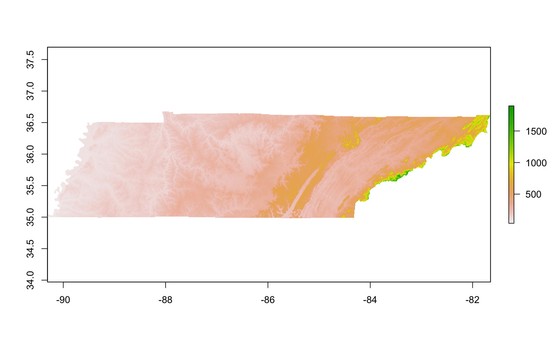
Cool, yeah? Now do the same for your favorite state.
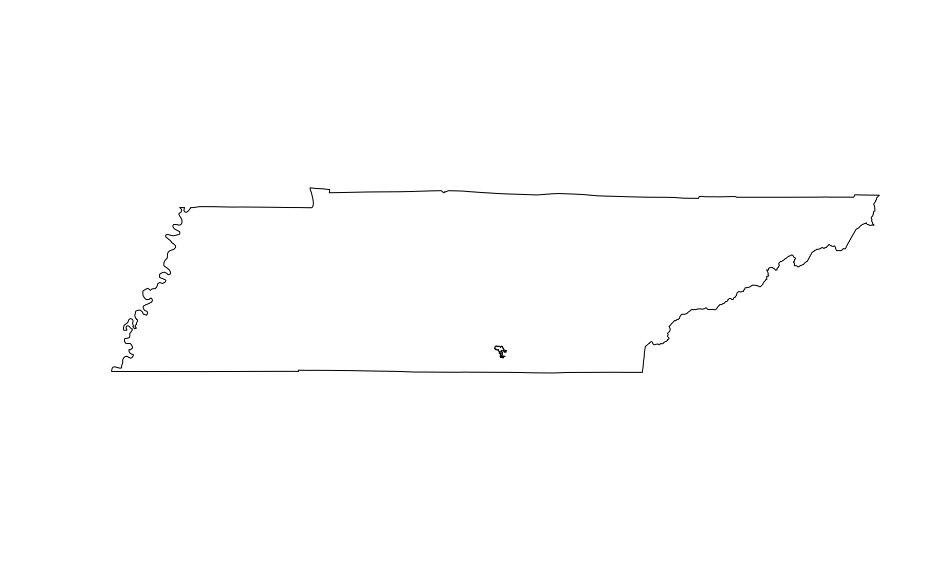
Make a plot of Tennessee. And then add
elevation(Sewanee elevation) to it.
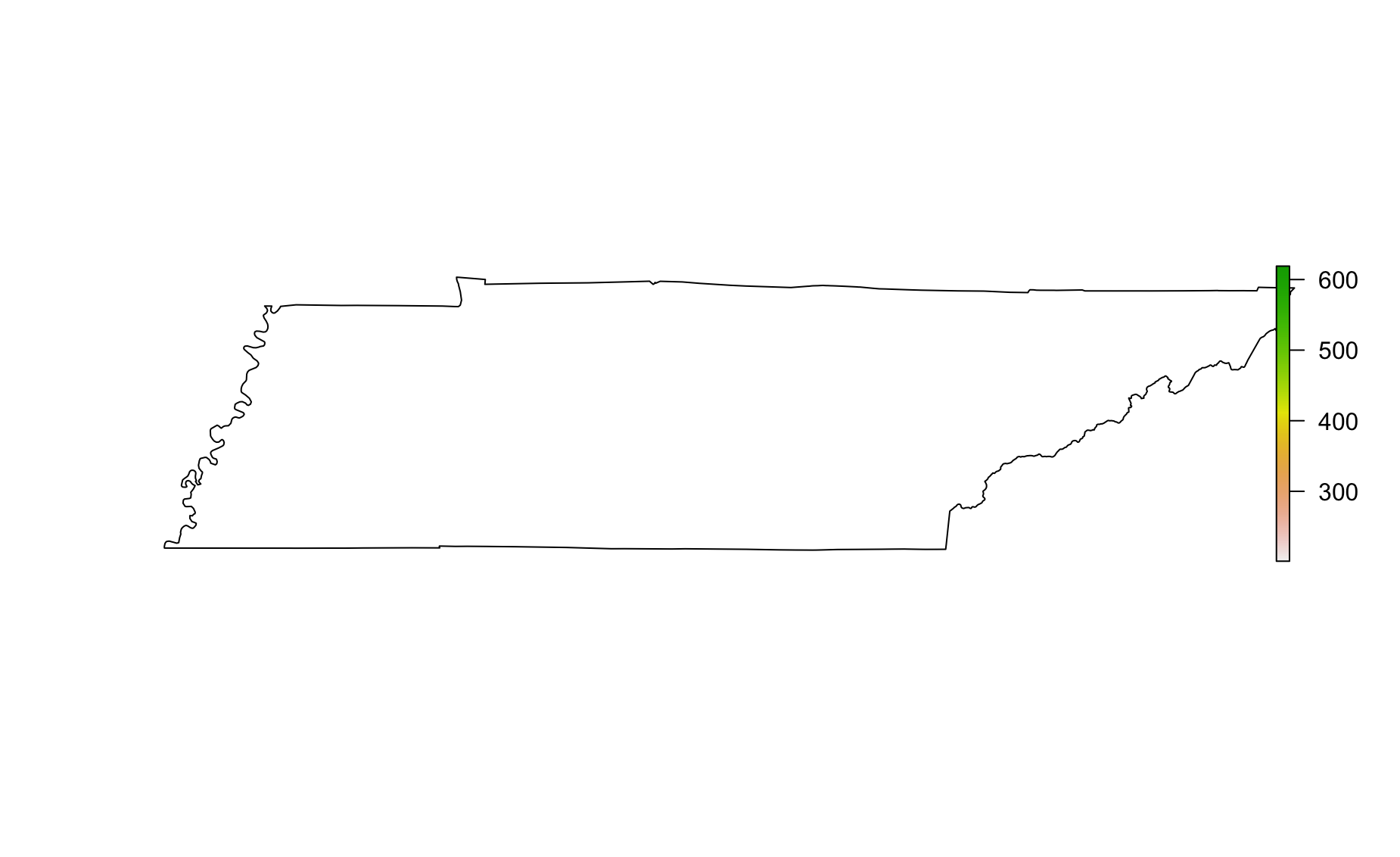
Oh no! That didn’t work. Why not? Have a look at coordinates
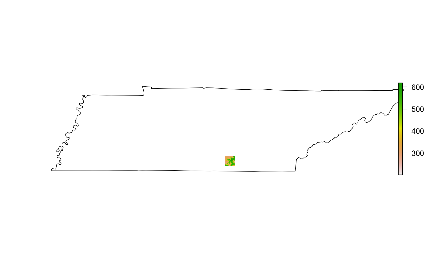
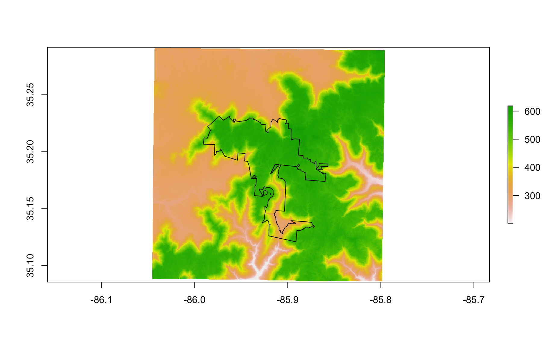
- It seems like things are on different coordinate systems. Let’s convert elevation to the coordinate system of Tennessee.
- Great! Now we can try plotting Sewanee elevation on Tennessee again
- Make a plot of Tennessee and add Sewanee’s domain (bounadry) to it.
Uh oh. Same problem as before. We need to “reproject” boundary to latitude longitude.
- Do it. Use the
spTransformfunction (notprojectRastersinceboundaryis not a raster).
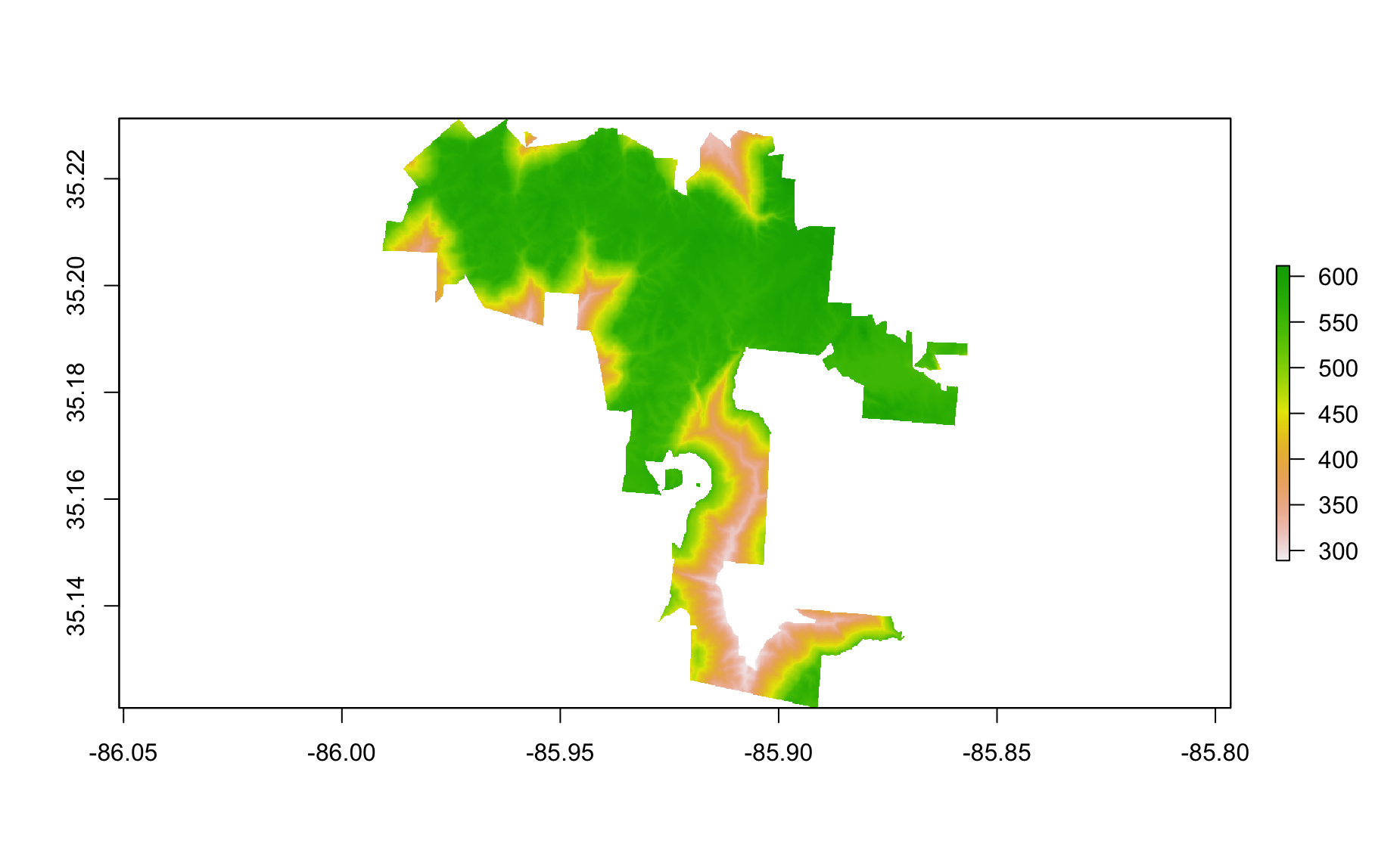
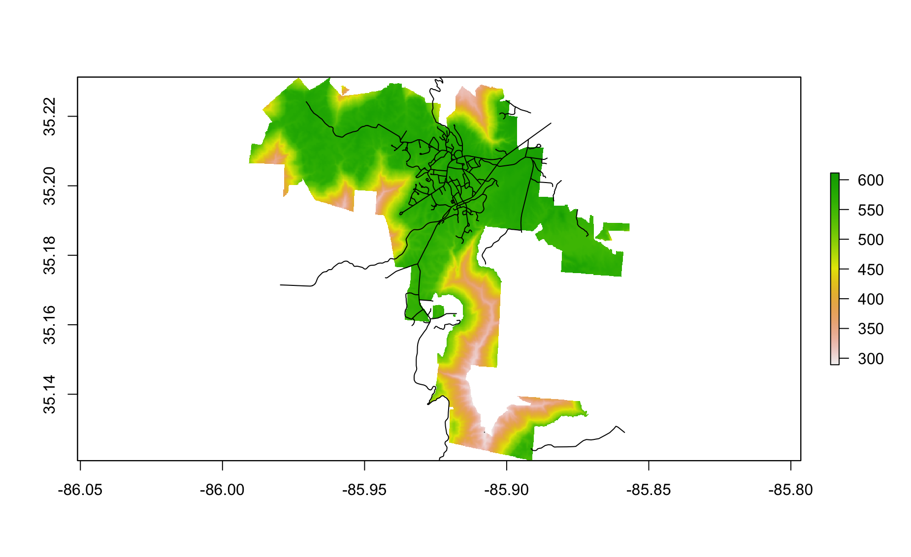
- Plot the Sewanee elevation in latitude and longitude and then add Sewanee boundary
- Use crop and mask to get just the elevation for the domain. Your plot should look like this.
- Add roads to the plot
Error in plot.xy(xy.coords(x, y), type = type, ...): plot.new has not been called yetOh no! Projection problems.
Reproject roads and add them.
Trim down the roads so that we only include those which are in the domain boundary area using the
overfunction.
- Make the below plot
- Let’s make a rasterVis contour raster plot
- Let’s make a level plot

- Let’s make a level plot
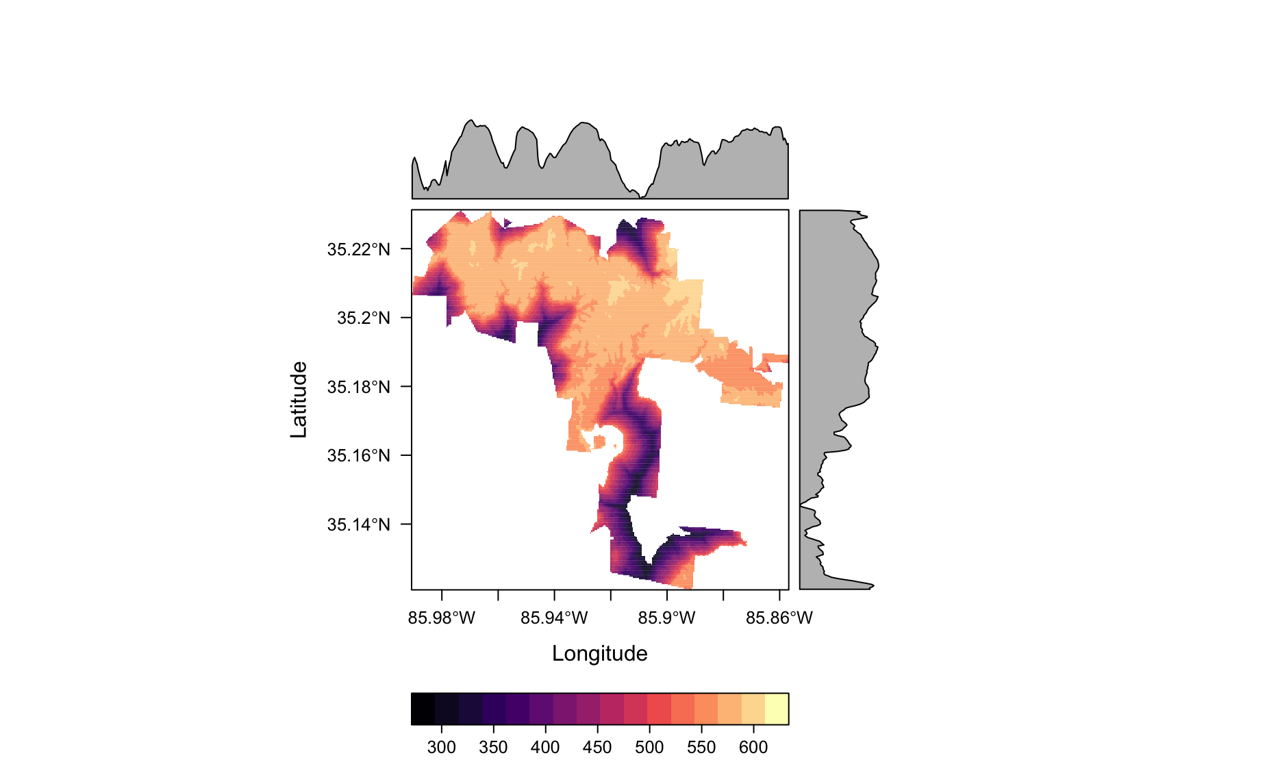
- How about a ggplot2-style plot
library(ggplot2)
domain_elev_df <- as.data.frame(domain_elev, xy = TRUE) %>%
  filter(!is.na(DEM_USGS_10m))


ggplot(data = domain_elev_df,
       aes(x = x,
                  y = y,
                  fill = DEM_USGS_10m)) +
  geom_raster() +
  scale_fill_gradient2(low = 'white', high = 'red')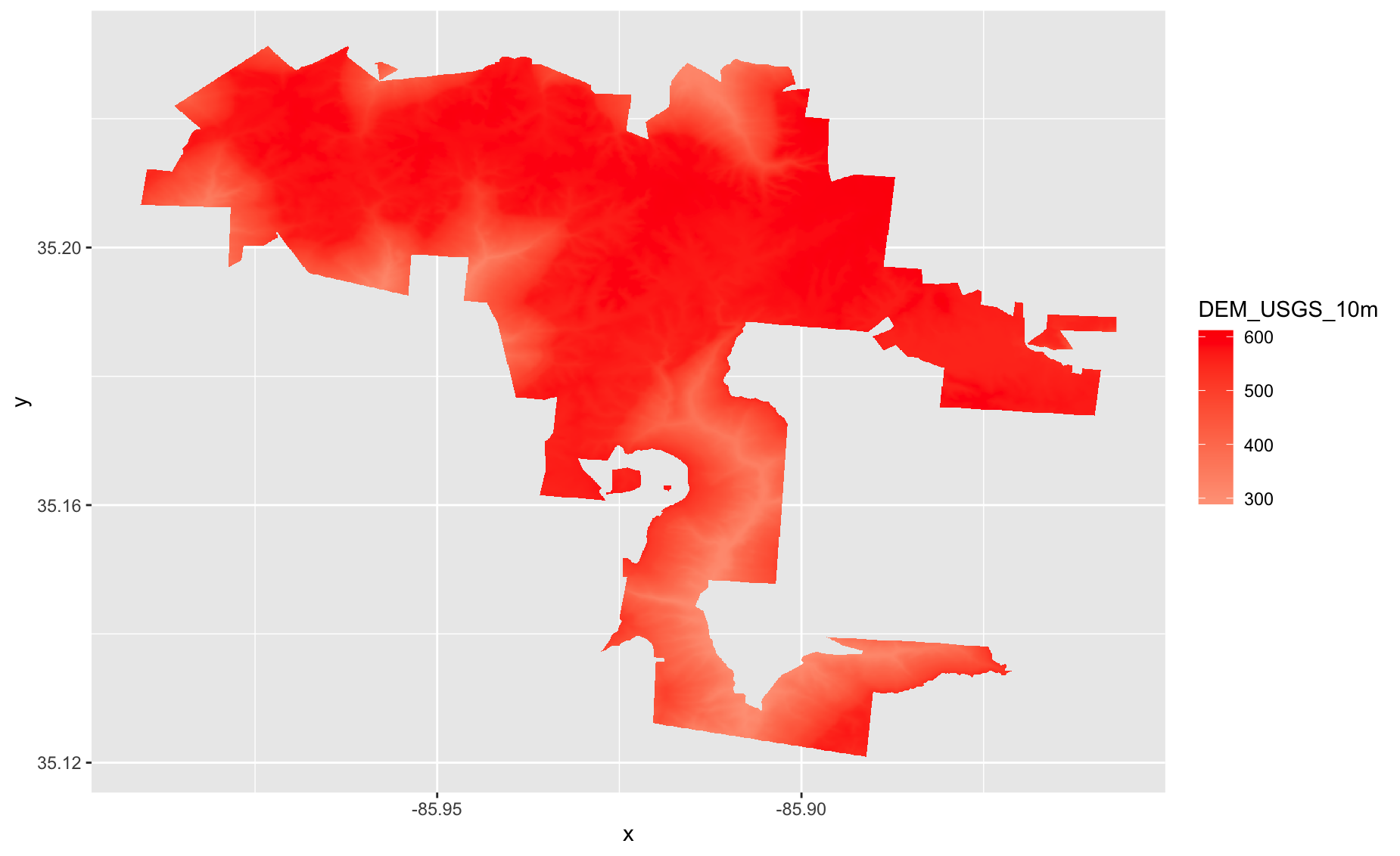
Make a ggplot-style raster plot of USA elevation
Let’s “bin” values in
elevationto say “high” or “low”.
cols <- c('black', 'yellow')
# add breaks to the colormap (6 breaks = 5 segments)
brk <- c(0, 300, 1000)

plot(elevation, col=cols, breaks=brk, main="High vs low")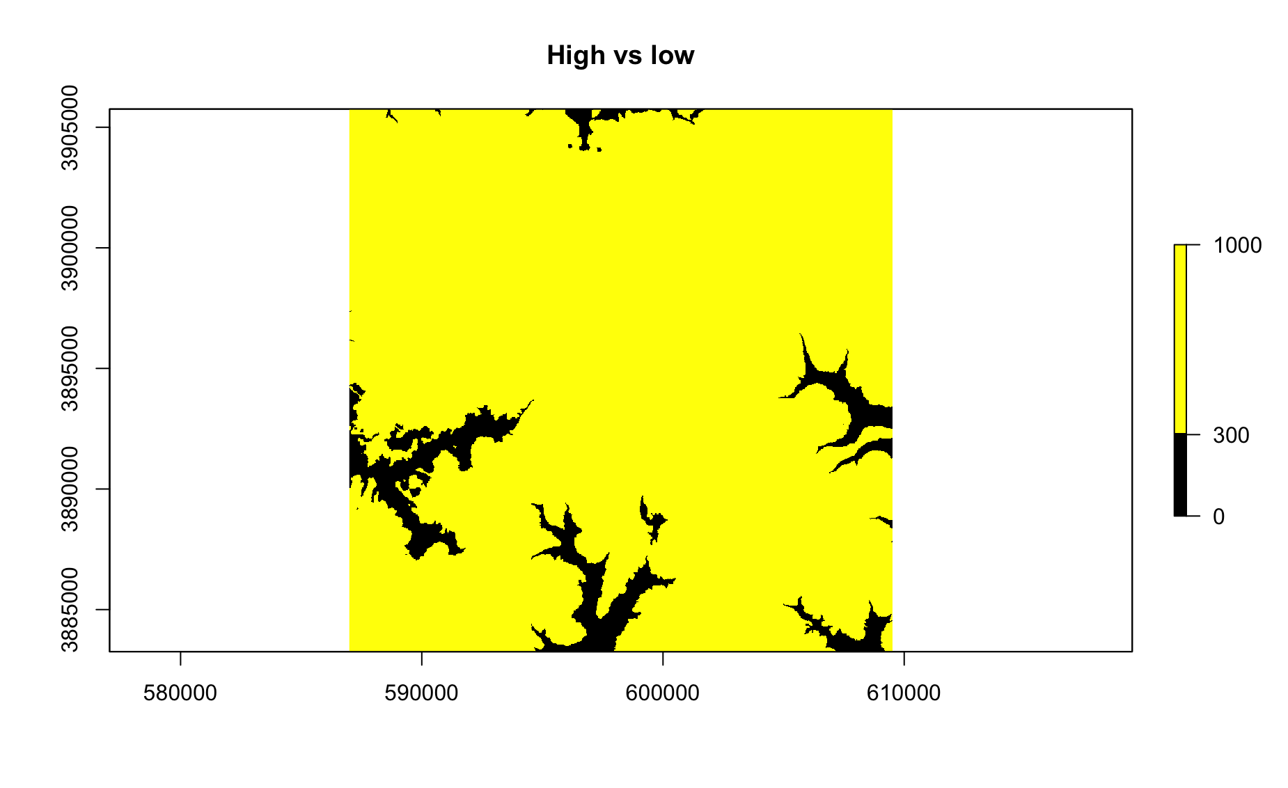
Do the same as above, but make 3 colors.
Let’s make a leaflet raster!
library(leaflet)
pal <- colorNumeric(c("#0C2C84", "#41B6C4", "#FFFFCC"), values(elevation_ll),
  na.color = "transparent")
leaflet() %>%
  addTiles() %>%
  addRasterImage(elevation_ll, colors = pal, opacity = 0.8) %>%
  addLegend(pal = pal, values = values(elevation_ll),
    title = "Elevation")
Add
structuresto the above. Hint: you’ll need to useaddPolygonsand you’ll need to reproject structures asstructures_ll…Add popups to your structures.
Make your structures a different color and remove the border (hint, you’ll need to use the
strokeargument)Get the elevation of each structure by running:
structure_elevation <-
  unlist(lapply(extract(elevation_ll, structures_ll),
         function(x){
           mean(x,na.rm = TRUE)
         }))
Use the
structure_elevationobject to add a new column to thestructures_llobject.Make a histogram of the elevation of Sewanee buildings.
How low is the lowest building on the domain? How low is it?
How high is the highest building on the domain? Which building is it?
Shapefiles / polygons
file_source <- 'https://raw.githubusercontent.com/databrew/intro-to-data-science/main/data/world_shp.RData'
library(dplyr)
library(rgdal)
library(raster)
library(sp)
library(readr)
destination_directory <- '/tmp'
destination_file <- file.path(destination_directory, 'world_shp.RData')
if(!'data/world_shp.RData' %in% destination_directory){
  download.file(file_source,
                destfile = destination_file)
}
load(destination_file)

# Read in indicator data
df <- read_csv('https://raw.githubusercontent.com/databrew/intro-to-data-science/main/data/hefpi.csv')

shp <- world_shp
Subset data by indicator & join with shape file data
pd <- df %>% filter(indicator_name =='Inpatient care use, adults')
shp@data <- left_join(shp@data, pd)
Make a basic (ugly) map
library(leaflet)
library(RColorBrewer)

# map text
map_palette <- colorNumeric(palette = brewer.pal(9, "Greens"), domain=shp@data$value, na.color="#CECECE")

    leaflet(shp) %>%
        addProviderTiles(provider = providers$Esri.WorldShadedRelief) %>%
        addPolygons(
          fillColor = ~map_palette(value),
          fillOpacity = 0.9)
Set min and max zoom
    leaflet(shp, options = leafletOptions(minZoom = 1,maxZoom = 10)) %>%
        addProviderTiles(provider = providers$Esri.WorldShadedRelief) %>%
        addPolygons(
          fillColor = ~map_palette(value),
          fillOpacity = 0.9)
Add label
    leaflet(shp, options = leafletOptions(minZoom = 1,maxZoom = 10)) %>%
        addProviderTiles(provider = providers$Esri.WorldShadedRelief) %>%
        addPolygons(
          color = 'black',
          weight=1,
          fillColor = ~map_palette(value),
          stroke=TRUE,
          fillOpacity = 0.9,
          label = ~round(value, 2))
Add legend
    leaflet(shp, options = leafletOptions(minZoom = 1,maxZoom = 10)) %>%
        addProviderTiles(provider = providers$Esri.WorldShadedRelief) %>%
        addPolygons(
          color = 'black',
          weight=1,
          fillColor = ~map_palette(value),
          stroke=TRUE,
          fillOpacity = 0.9,
          label = ~country
        ) %>%
        addLegend( pal=map_palette, values=~value, opacity=0.9, position = "bottomleft", na.label = "NA" )
Add fancy text to map
library(htmltools)

# Create map
map_text <- paste(
  "Indicator: ",  shp@data$indicator_name,"<br>",
  "Economy: ", as.character(shp@data$country),"<br/>",
  'Value: ', round(shp@data$value, digits = 2),  "<br/>",
  "Year: ", as.character(shp@data$year),"<br/>",sep="") %>%
  lapply(htmltools::HTML)

    leaflet(shp, options = leafletOptions(minZoom = 1,
                                                maxZoom = 10)) %>%
        addProviderTiles('Esri.WorldShadedRelief') %>%
        addPolygons(
          color = 'black',
          fillColor = ~map_palette(value),
          stroke=TRUE,
          fillOpacity = 0.9,
          weight=1,
          label = map_text,
          highlightOptions = highlightOptions(
            weight = 1,
            fillColor = 'white',
            fillOpacity = 1,
            color = "white",
            opacity = 1.0,
            bringToFront = TRUE,
            sendToBack = TRUE
          ),
          labelOptions = labelOptions(
            noHide = FALSE,
            style = list("font-weight" = "normal", padding = "3px 8px"),
            textsize = "13px",
            direction = "auto"
          )
        ) %>%
        addLegend( pal=map_palette, values=~value, opacity=0.9, position = "bottomleft", na.label = "NA" )
Exercise
Make a choropleth map of BMI for men, where the darker the shade of red, the higher the BMI for each country.
Remove the borders from the map
Add a legend on the top right of the map
Make the NA color blue
Make the hover label a combination of the country and BMI value
Make the title of the legend “BMI”
Create a function that takes an indicator name as an input and creates a map.