Module 24 Interactive shiny dashboards
Learning goals
Learn how to create interactive web-based apps and dashboards with
shiny.Why
shinyis so awesome and valuable in reproducible data science.
Overview
Shiny is a package that makes it easy to build interactive web applications and dashboards in R.
First we need to install and load the package:
Shiny apps consists of two main parts:
The UI, which stands for User Interface. The UI controls what is being displayed on the application page and how the components are laid out. This may include text and other
markdownelements, graphics, widgets that take in user input, or plots. You will also use the UI to define a navigation bar with multiple tabs in this tutorial.The Server. The server controls the data that will be displayed through the UI. The server will be where you load in and wrangle data, then define your outputs (i.e. plots) using input from the UI.
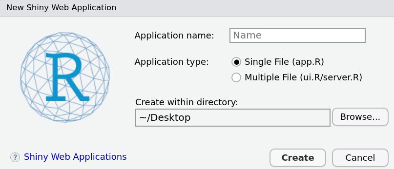
Lets get started! Navigate to the left hand corner of the Rstudio screen and select: File > New File > Shiny Web App.. Create a name for your application and save to your directory.
This will open a script with pre-populated code that is deployment-ready. To run the app, simply click the “Run App” button in the top right. You should see a window appear like this:

Click on the slider and drag it to the left and the right. See how the plot “reacts”? That is why shiny is referred to as an interactive app.
&nbps;
Let’s break down each function to get a better understanding of the app’s guts.
The ui
ui <- fluidPage(
    titlePanel("Old Faithful Geyser Data"),
    sidebarLayout(
        sidebarPanel(
            sliderInput("bins",
                        "Number of bins:",
                        min = 1,
                        max = 50,
                        value = 30)
        ),
        mainPanel(
           plotOutput("distPlot")
        )
    )
)fluidPage: Gives us a flexible page to work with by making it easy to position elements of the app (inputs, text, plots, etc) beside each other (rows) and on top of each other (columns). Note that each nested function within thefluidPagefunction is separated by a comma.titlePanel: An optional title.sidebarLayout: Creates a layout inuithat splits the screen into a sidebar (sidebarPanel) & and main section (mainPanel).sidebarPanel: Typically reserved for app inputs.sliderInput: One of manyshinywidget inputs to manipulate data.mainPanel: Typically reserved for app outputs (plots, tables, etc)plotOutput: Ashinyfunction that displays a plot that is created in the server.
The server
server <- function(input, output) {

    output$distPlot <- renderPlot({
        x    <- faithful[, 2]
        bins <- seq(min(x), max(x), length.out = input$bins + 1)
        hist(x, breaks = bins, col = 'darkgray', border = 'white')
    })
}output$distPlot: An output of the app. In this case, that output is a plot. The output has a named,distPlot, so that it can be referred to in theUI.renderPlot: Ashinyfunction to builds the plot.
The shinyApp( ... ) command
The ui and server commands should build the pieces for an app. The app actually gets built when they are combined in the function shinyApp(ui, server).
Overview of the overview
The key differences between the ui and server are that …
The
uitakes inputs (e.g.,sliderInput) and displays outputs (e.g.,renderPlot), whereas the server creates outputs (e.g., a plot). In our default example the input is simply a number from 1 to 50 to determine the number of bins in the output (a histogram).The
uiactually outputs the outputs that are rendered byserver. In the server, you’ll find functions likerenderPlot, but in theuiyou will find functions likeplotOutput. (Confusing, we know.)
Every shiny app you build will follow the same basic format:
####################################################################
# Shiny app template ###############################################

# Add libraries here

# Load data here

####################################################################
ui <- fluidPage(

)

####################################################################
server <- function(input,output){

}

####################################################################
shinyApp(ui = ui, server = server)
Build your first shiny app
First, delete the code currently in your shiny script and paste the template code above into the script. If you click ‘Run App’, a blank window should appear.
Second, add some libraries to the top of your script:
Next, load some data from the package gapminder, which provides country-level data on life expectancy, GDP per capita, and population for the last half century.
Now, setup a layout for your ui. Add the following code inside the fluidRow parentheses:
Run App and make sure everything still works. Repeat that action after each following step.
(You will want to get in the habit of re-building the app everytime you make a change. It makes fixing errors much less of a headache.)
Now add an input that allows the user to choose a country to plot. Add this code to the sidebarPanel:
selectInput(inputId = "country_name",
label = "Choose a country",
choices = unique(gm$country),
selected = 'Mexico')Now add a plot to your app. Add this code to the mainPanel of your ui:
And add this code to your server:
output$country_plot <- renderPlot({
cn <- input$country_name
pd <- gm %>% dplyr::filter(country == cn)
ggplot(pd, aes(year, pop)) +
geom_point() +
geom_line() +
labs()
})Now run your app and try changing the country selected in the drop-down menu; does the plot react?
Let’s add some more inputs to the sidebarPanel, to adjust the way the chart looks. First, make sure there is a comma after the selectInput that creates the country drop-down. Then add this code:
selectInput(inputId = "line_color",
label = "Choose a color for the line",
choices = c('green', 'blue','red', 'orange'),
selected = 'green'),
selectInput(inputId = "point_color",
label = "Choose a color for the points",
choices = c('green', 'blue','red', 'orange'),
selected = 'green'),
sliderInput(inputId = "line_size",
label = "Change the thickness of the line",
min = 1,
max = 10,
value =2),
sliderInput(inputId = "point_size",
label = "Change the point size",
min = 1,
max = 10,
value =5),
sliderInput(inputId = 'alpha_value',
label = 'Change transparency of line and points',
min= 0,
max=1,
value =0.5)Then update the server code to react to these new inputs:
output$country_plot <- renderPlot({
cn <- input$country_name
lc <- input$line_color
ps <- input$point_size
ls <- input$line_size
pc <- input$point_color
av <- input$alpha_value
pd <- gm %>% dplyr::filter(country == cn)
ggplot(pd, aes(year, pop)) +
geom_point(color = pc, size = ps, alpha=av) +
geom_line(color = lc, size = ls, alpha=av) +
labs(title = cn)
})Now add an additional input to the sidebar that allows the user to choose which variable to plot:
selectInput(inputId = 'plot_var',
label = 'Choose a variable to plot',
choices = c('lifeExp', 'pop', 'gdpPercap'),
selected = 'pop')And update the server output:
output$country_plot <- renderPlot({
cn <- input$country_name
lc <- input$line_color
ps <- input$point_size
ls <- input$line_size
pc <- input$point_color
av <- input$alpha_value
pv <- input$plot_var
pd <- gm %>% dplyr::filter(country == cn)
ggplot(pd, aes_string('year', pv)) +
geom_point(color = pc, size = ps, alpha=av) +
geom_line(color = lc, size = ls, alpha=av) +
labs(title = cn)
})Now let’s modify our app so that you can display multiple countries at once. First, modify the selectInput for the input country_name:
selectInput(inputId = "country_name",
label = "Choose a country",
choices = unique(gm$country),
multiple=TRUE,
selected = 'Mexico')Now let’s modify these lines of code inside the server’s renderPlot call:
pd <- gm %>% dplyr::filter(country %in% cn)
ggplot(pd, aes_string('year', pv, group='country')) +
geom_point(color = pc, size = ps, alpha=av) +
geom_line(color = lc, size = ls, alpha=av) +
labs(title = cn)The final version of your app’s code should look like this:
####################################################################
# Shiny app template ###############################################
# Add libraries here
library(shiny)
library(dplyr)
library(gapminder)
library(ggplot2)
# Load data here
gm <- gapminder
####################################################################
ui <- fluidPage(
titlePanel("The economics of global health"),
sidebarLayout(
sidebarPanel(
selectInput(inputId = 'plot_var',
            label = 'Choose a variable to plot',
            choices = c('lifeExp', 'pop', 'gdpPercap'),
selected = 'pop'),
selectInput(inputId = "country_name",
                        label = "Choose a country",
                        choices = unique(gm$country),
                        multiple=TRUE,
selected = 'Mexico'),
sliderInput(inputId = "line_size",
label = "Change the thickness of the line",
min = 1,
max = 10,
value =2),
sliderInput(inputId = "point_size",
label = "Change the point size",
min = 1,
max = 10,
value =5),
sliderInput(inputId = 'alpha_value',
label = 'Change transparency of line and points',
min= 0,
max=1,
value =0.5)
),
mainPanel(
plotOutput("country_plot")
)
)
)
####################################################################
server <- function(input,output){
output$country_plot <- renderPlot({
cn <- input$country_name
ps <- input$point_size
ls <- input$line_size
av <- input$alpha_value
pv <- input$plot_var
pd <- gm %>% dplyr::filter(country == cn)
ggplot(pd, aes_string('year', pv, color='country')) +
geom_point(size = ps, alpha=av) +
geom_line(size = ls, alpha=av) +
labs(title = cn)
})
}
####################################################################
shinyApp(ui = ui, server = server)Final thoughts
Shiny apps are nifty and cool, but they are also an important tool for reproducible research.
Imagine that you are a data science consultant, and your client asks you to help them answer a mission-critical question with their company’s datasets.
Think about the difference between these two scenarios:
(1) You analyze the data, produce a plot, paste it into a Word document, and send the client a PDF.
(2) You build a shiny app based on their datasets, and pass the URL for the app to the client. They explore the data for and find the answer for themselves. While they are exploring the data, they are discovering new insights, generating new questions, and finding answers to questions they did not know they had.
One of these scenarios is reproducible and empowering. The other is not.
Exercises
A COVID-19 shiny app
1. Go to github.com, sign-in, and create a new repository called shiny_examples.
2. Clone that repository to your Documents folder using git.
3. Create a new folder named covid_data inside your shiny_examples repo.
4. Inside that folder, create a shiny file (app.R) and paste the app template from above.
5. Add these libraries to your script:
6. Add this code to read in the data on COVID-19.
df <- read_csv('https://raw.githubusercontent.com/databrew/intro-to-data-science/main/data/covid_data.csv')
pop <- read_csv('https://raw.githubusercontent.com/databrew/intro-to-data-science/main/data/state_pop.csv')
7. Create a title for the app called “Covid-19 cases and deaths by state”.
8. In the side panel of your ui, create an input that allows the user to choose a state.
9. Create a bar chart called cases_month that plots a state’s Covid-19 cases by month.
10. Add an input called bar_color that controls the color that fills the bar plot.
11. Add an input called alpha_value that controls the transparency of the bars in the chart.
12. Create another bar chart called deaths_month that plots a states Covid-19 deaths by month.
13. Use the already created inputs bar_color and alpha_value to control the color and transparency of the new bar chart.
14. Create a line plot called cumulative_cases that plots the cumulative cases over time (hint: use the function cumsum).
15. Create a line plot called cumulative_deaths that plots the cumulative deaths over time (hint: use the function cumsum).
16. At the top of your script, join the population data (pop) to the Covid-19 data. Create two new variables: covid_deaths_per_100k and covid_cases_per_100k.
17. Create a line plot that plots the cases and deaths per 100k in one chart.
18. Create an input that controls the line colors for the above chart.
19. Add a title to all plots that combines the name of the state selected and a description of the chart.
20. Add a theme to each plot using the ggthemes library.
21. There should now be five charts. Use the fluidRow() and column() argument to put the bar charts side by side. Under the bar charts, put the line plots side by side. Under those, put the final line plot centered in the middle of the screen.
22. Use the shinythemes package to customize your app (https://rstudio.github.io/shinythemes/).
23. Deploy the app to shinyapps.io.